

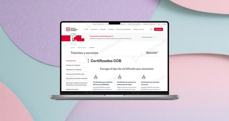
Access to Certificates

We redesigned the access to certificates on the CCB website, simplifying routes, menus, and critical screens to improve the user experience and raise the portal’s NPS.
+10
points in the web portal’s NPS after certificate access optimization.
<5%
error rate in certificate downloads
Methodology


Boom!
User test
Prototipes
Wireframes
Interviews
UX Research
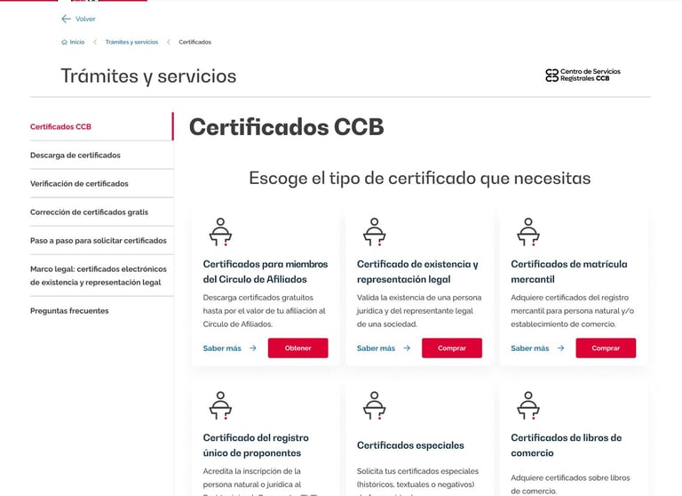
The problem
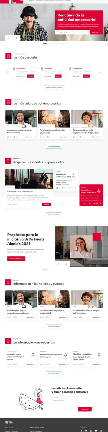
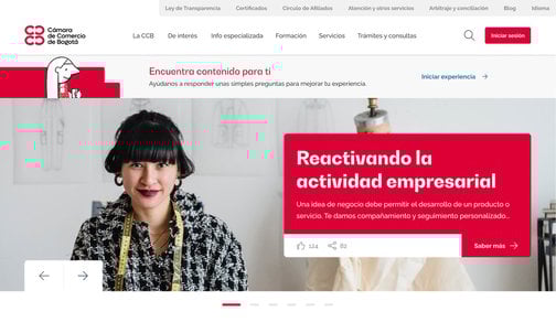
Certificates represented 60% of traffic on the CCB website but paradoxically generated the highest volume of complaints, negatively impacting the overall NPS. Users faced complex navigation with technical terminology (“Servicios Registrales”), multiple confusing routes, and a post-purchase experience that left them uncertain about the status of their request.
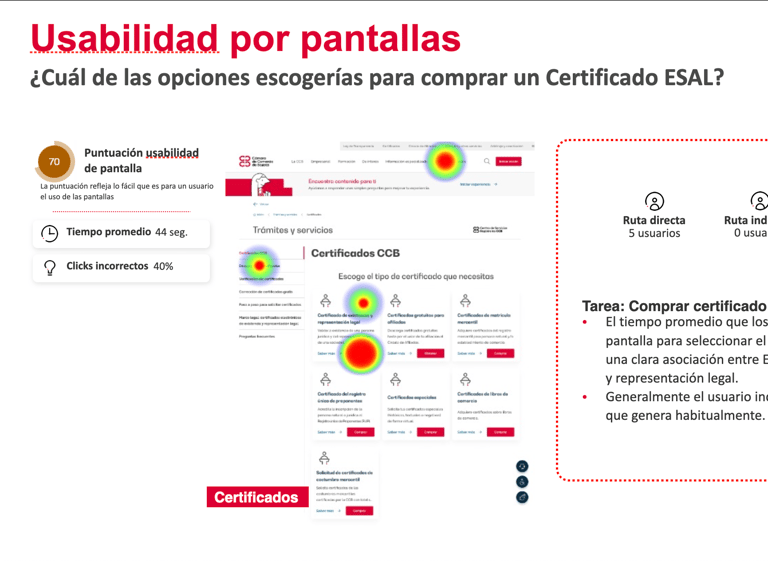
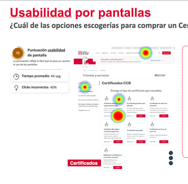
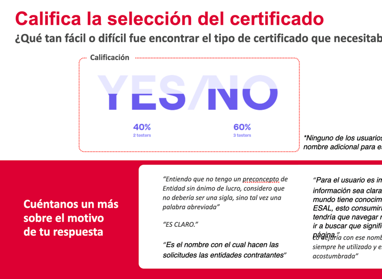
VOC analysis revealed that 55% of users made incorrect clicks when trying to find certificates, and 40% abandoned the process to look for alternatives such as Google or the RUES portal.
The challenge
Comprehensively redesign the certificate experience without disrupting existing operations, transforming a fragmented process into a seamless experience that met the expectations of entrepreneurs who perform this task daily.

Strategic research & discovery
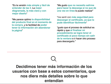
I conducted an in-depth VOC analysis that revealed critical patterns: experienced users navigated by memory, while new users got lost in the technical terminology. Interviews with 9 users confirmed that “Servicios Registrales” was only understood by accountants, not by the average entrepreneur. I analyzed navigation patterns in platforms like DIAN, digital banks, and regional chambers of commerce, identifying that terms such as “Trámites y Consultas” (“Procedures & Queries”) had broader recognition.
Information architecture
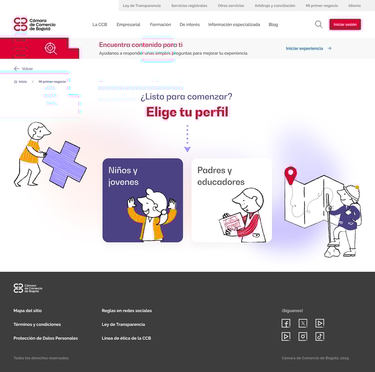
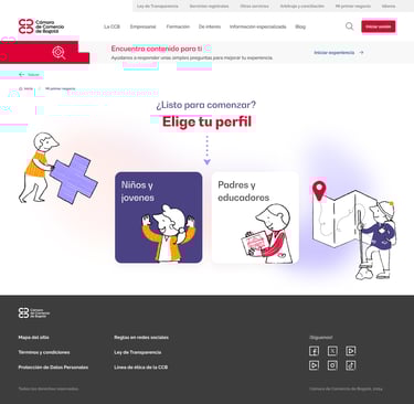
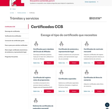
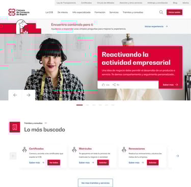
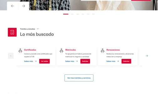
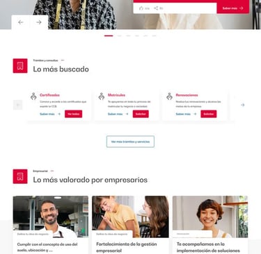
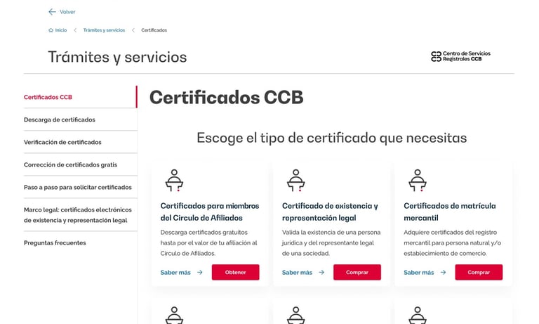
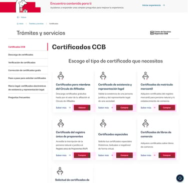
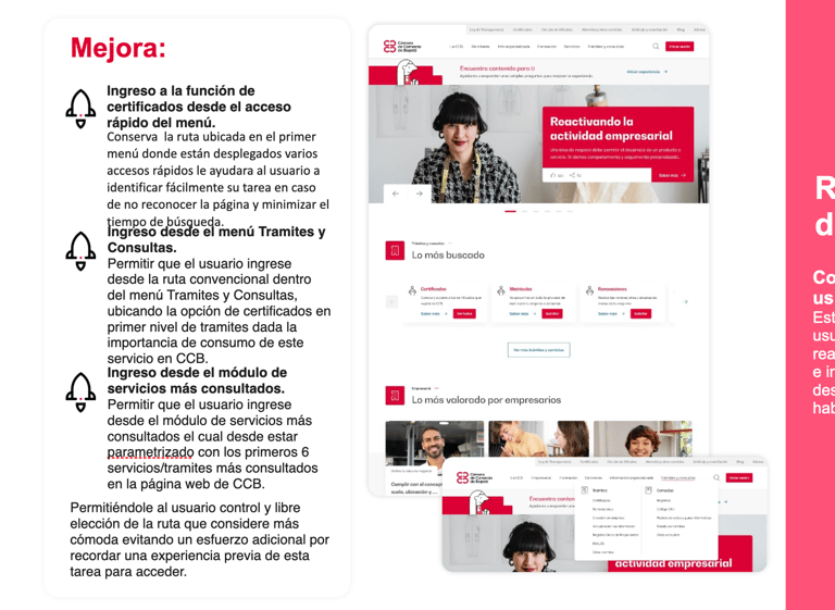
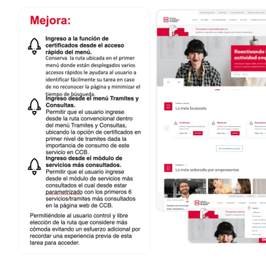
I redesigned the navigation structure, transforming “Servicios Registrales” into “Trámites y Consultas” and creating multiple access routes: main menu, quick links on the homepage, and a “most consulted services” module.
I reorganized the information hierarchy to prioritize transactional actions, grouped similar certificates to reduce cognitive load, and implemented familiar naming conventions that matched the terminology used by requesting entities.
Prototyping and iterative validation
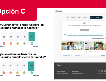
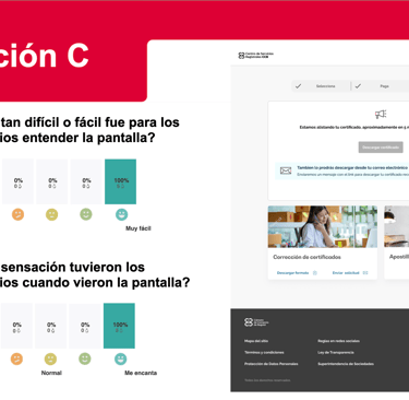
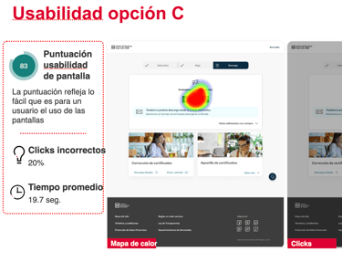
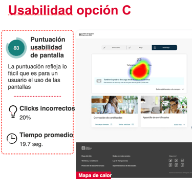
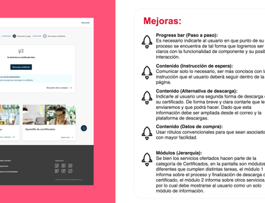
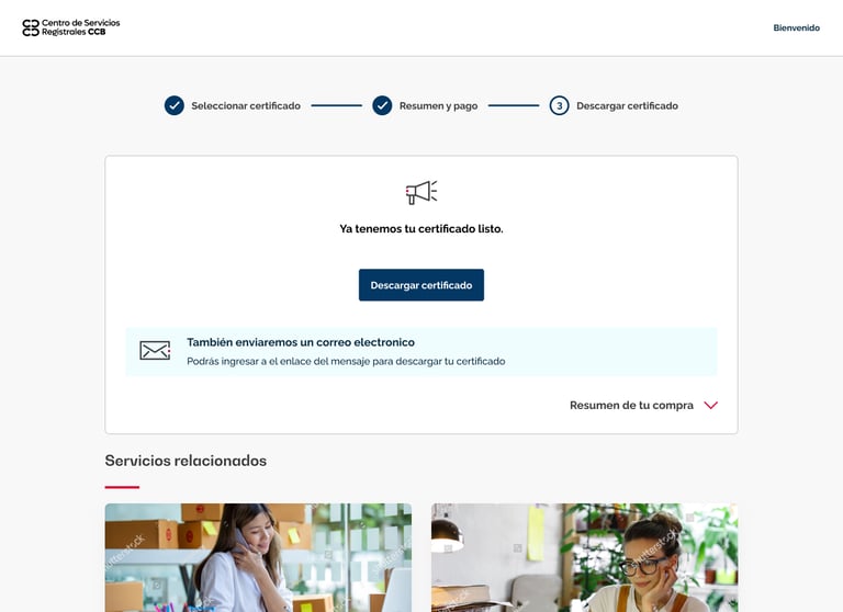
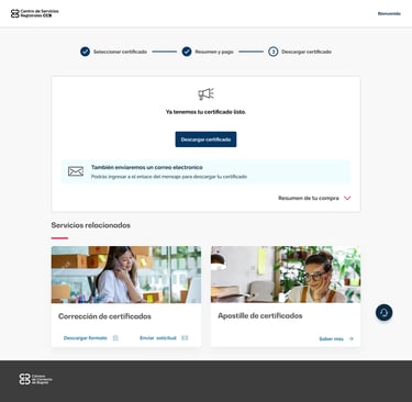
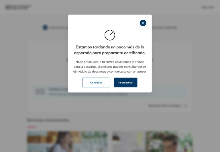
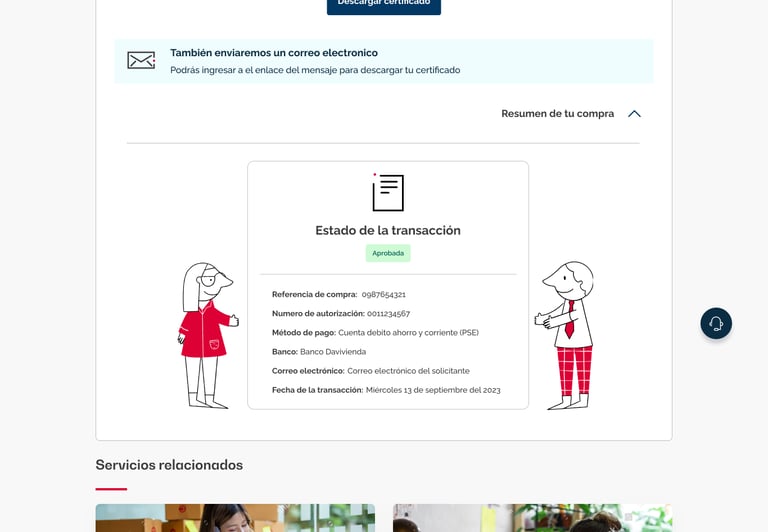
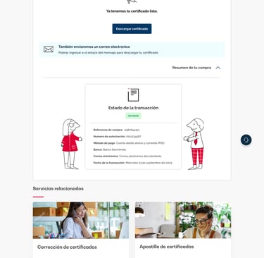
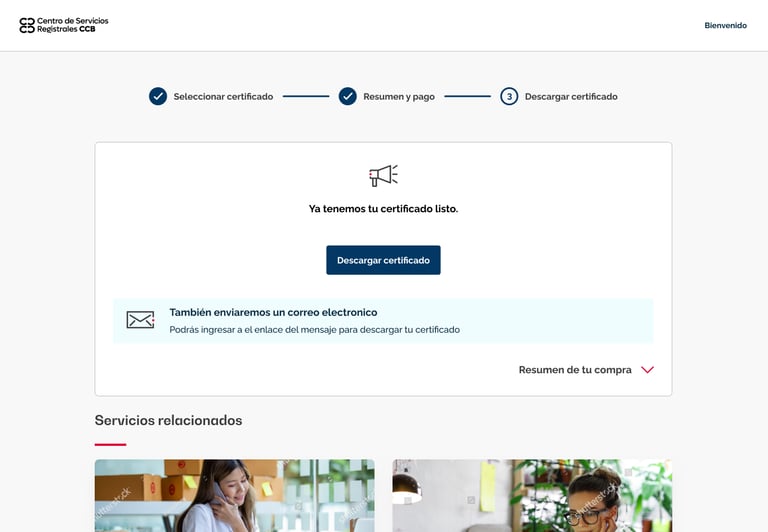
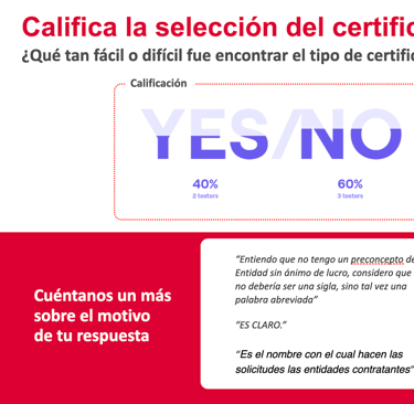
I ran moderated remote testing and A/B tests with users to validate three different menu structures. Option C showed 100% successful direct routes vs. 20% in the original structure. I designed a confirmation screen that communicated a specific wait time (5 minutes), real-time process status, and download alternatives—eliminating the uncertainty that previously generated distrust.
Stakeholder facilitation and alignment
I led an in-person workshop with key areas (GAC, Registry Services, and the Experience team), applying design thinking methodologies to align technical vision with user needs. I implemented structured voting exercises that led to measurable consensus on terminology and hierarchy. Additionally, I developed an impact–effort matrix to prioritize high-value improvements such as homepage quick links and hierarchical reorganization, versus complex implementations with lower return.
Long-Term impact
The web portal’s NPS increased from 48.7 to 58+ points, an extraordinary leap for this indicator. Errors in certificate downloads dropped to less than 5% after optimization, and the average search time decreased from 192 to 17 seconds.
The user testing methodology was adopted as a standard for future redesigns, establishing evidence-based decision-making that influenced CCB’s overall digital strategy. This set a precedent for registry services, driving continuous improvements across its key products.


This project demonstrated that improving user experience goes beyond interfaces: it required aligning business metrics like NPS with design decisions, deep research, and iterative validation. By transforming a critical service for entrepreneurs, we reduced friction, built digital trust, and consolidated a model of continuous improvement within the CCB.